Twenty-nine websites. Twenty-nine different businesses.
Every one built the way yours would be, planned, designed and written for a specific trade with specific customers. Every concept has a working homepage and detailed inner page, rather than being a static mock-up.
Start with how your business should feel.
Trust and authority
For businesses where the first job is reassurance. Accountants, solicitors, surveyors, consultants. Someone landing here is deciding whether to trust you with something that matters, so the design has to feel steady before it tries to be interesting.
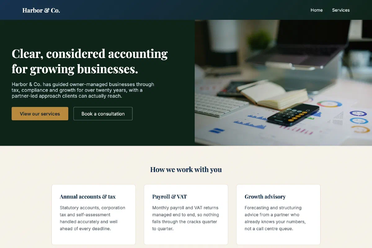 View the site
Harbor & Co. Accountants
Professional & formal
A trust-building layout for a firm where clients want to feel reassured before they even call.
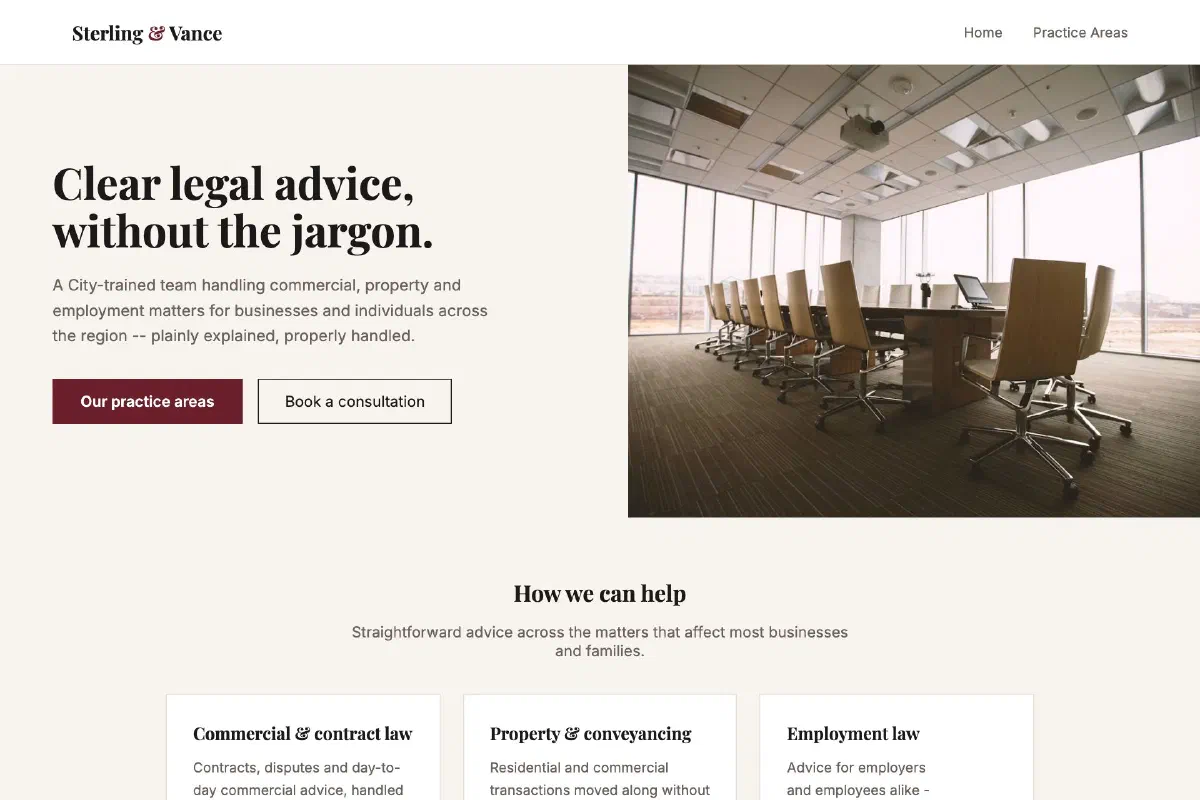 View the site
Sterling & Vance Legal
Professional & formal
A second take on professional and formal, burgundy and charcoal in place of navy, for a firm with its own voice.
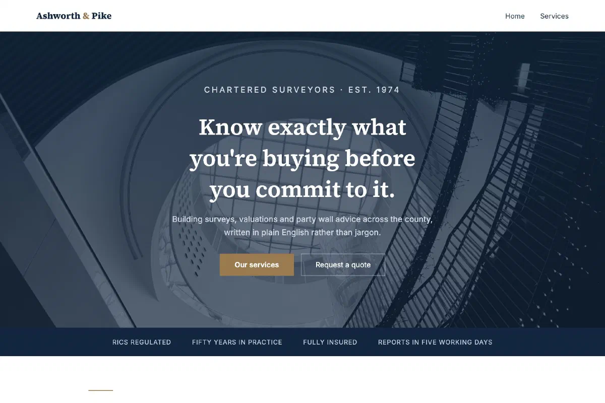 View the site
Ashworth & Pike Surveyors
Professional & formal
Fifty years of practice made legible: credentials up front, and a services grid that reads like a well-set document.
Restraint and craft
For work that should speak for itself. Architects, designers, photographers, studios. Generous space, quiet typography and photography given room, so the portfolio does the persuading rather than the layout.
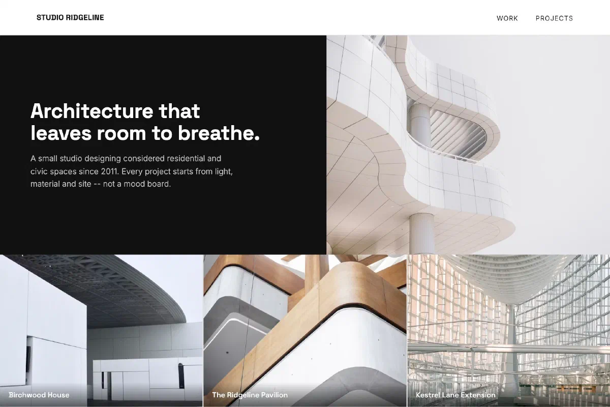 View the site
Studio Ridgeline Architecture
Modern & minimal
Generous white space and restrained type, built to let a portfolio of project photography do the talking.
 View the site
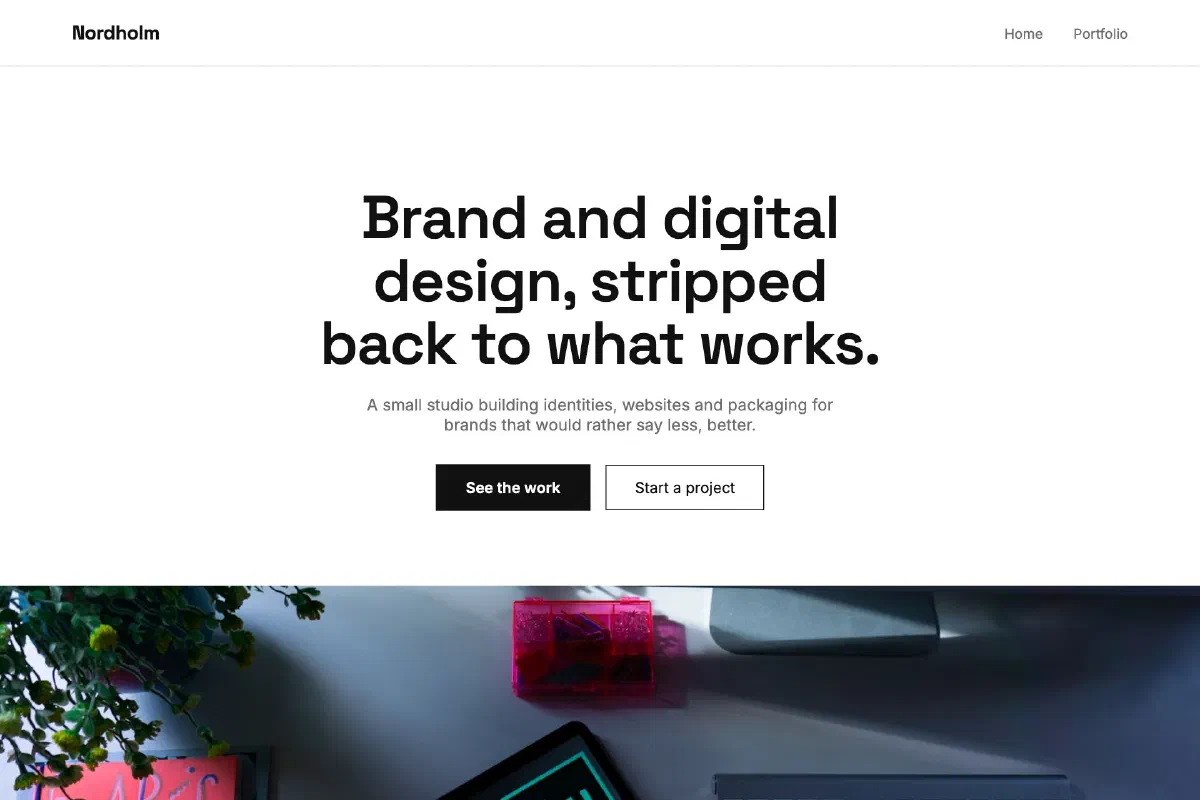
Nordholm Studio
Modern & minimal
A monochrome, type-led layout for a design studio that would rather the work speak than the site.
 View the site
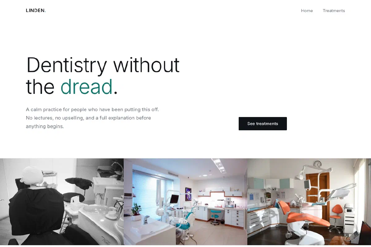
Linden Dental
Modern & minimal
Enormous light type and a published fee list, for a practice whose whole pitch is that nothing here is hidden from you.
Warmth and approachability
For businesses people walk into. Bakeries, salons, family practices, local services. Friendly without being childish, and built so opening hours, location and phone number are never more than a glance away.
 View the site
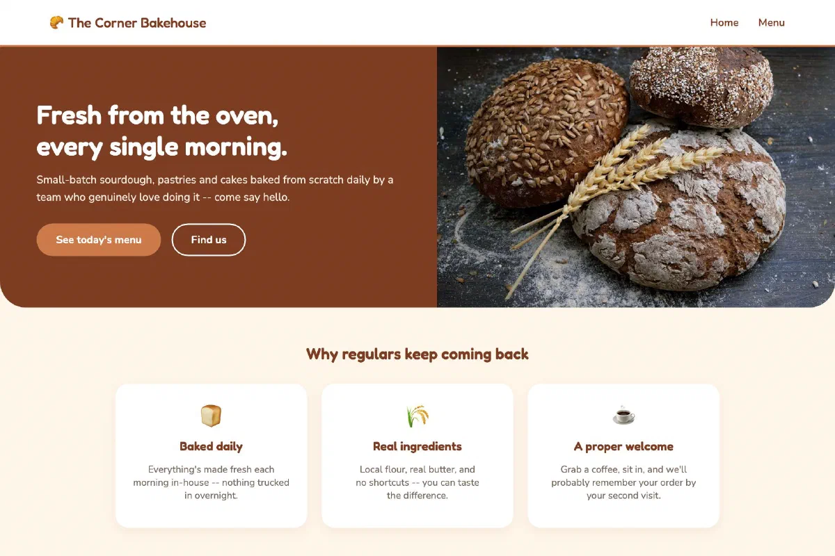
The Corner Bakehouse
Friendly & approachable
Warm colour, rounded shapes and a conversational tone for a business that lives on local word of mouth.
 View the site
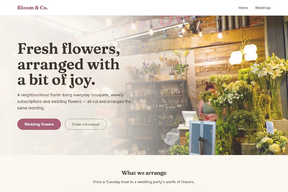
Bloom & Co. Florist
Friendly & approachable
Soft pink and sage in place of warm brown, proof the same friendly warmth can wear more than one palette.
 View the site
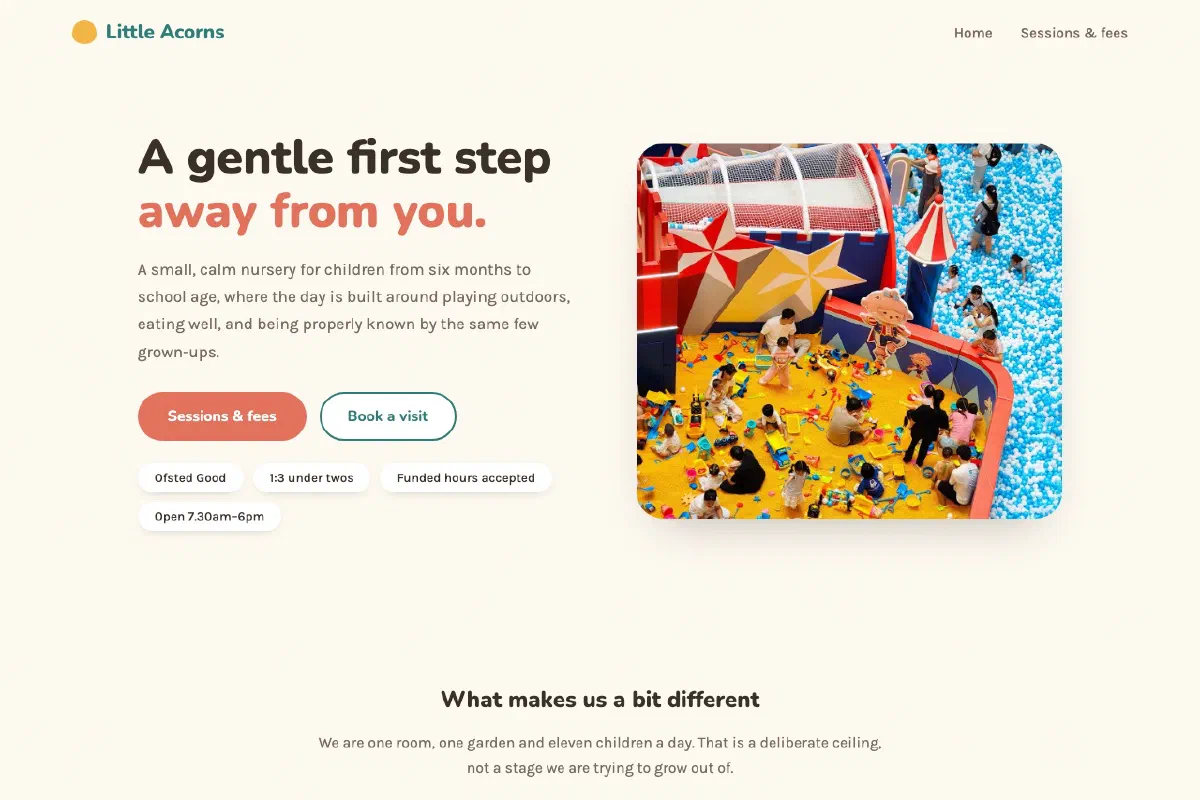
Little Acorns Nursery
Friendly & approachable
Rounded cards and a warm palette carrying genuinely practical detail, session times, real fees, and what a day actually looks like.
Energy and momentum
For businesses that need to feel alive. Gyms, studios, clubs, events. Strong colour, confident type and photography with movement in it, the design equivalent of a room with the music on.
 View the site
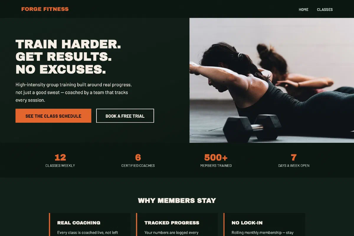
Forge Fitness Studio
Bold & energetic
High contrast, strong type and motion-suggesting layout for a brand that wants to feel immediately alive.
 View the site
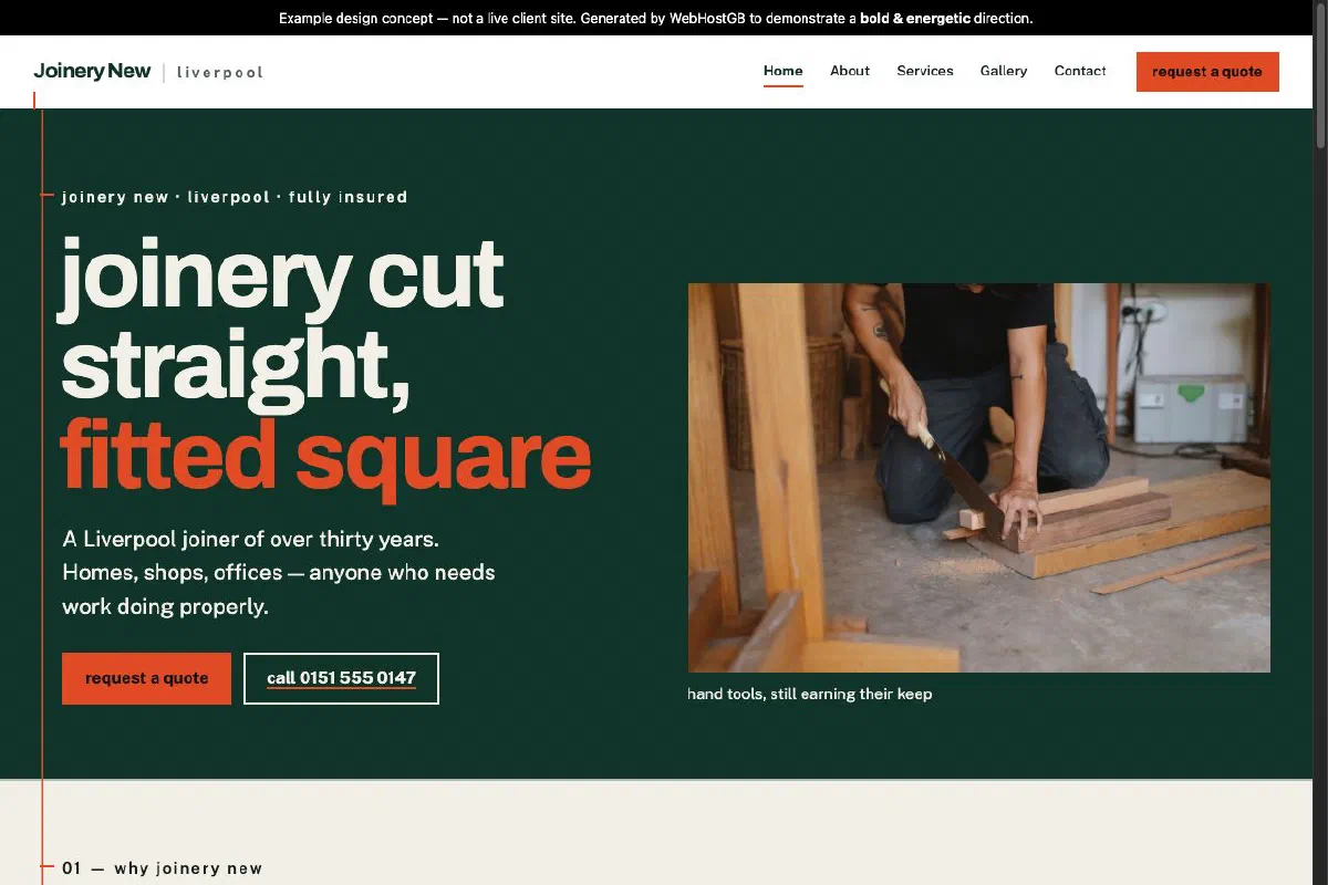
Joinery New
Bold & energetic
A five-page site built around a carpenter's set-out line: confident type, sharp rules and a restrained workshop palette without the usual trade-site clichés.
 View the site
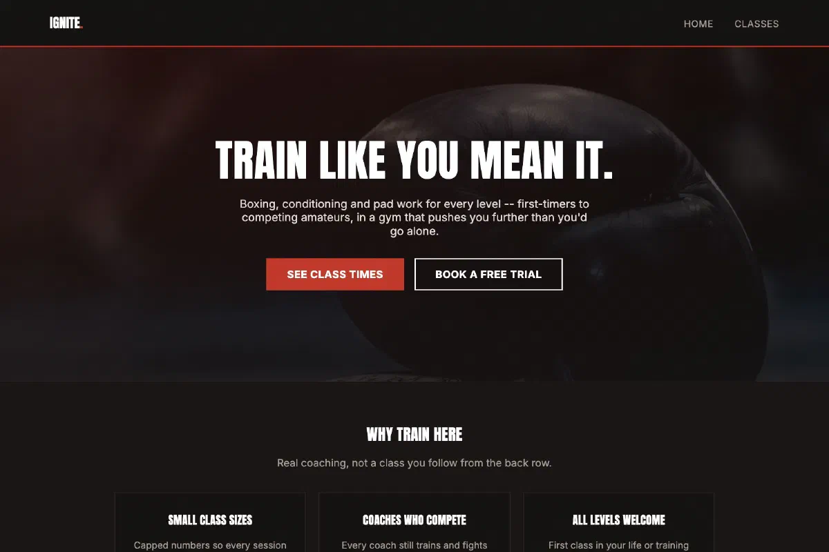
Ignite Boxing Club
Bold & energetic
Punchy colour and heavy type built to feel like motion, even standing still on the page.
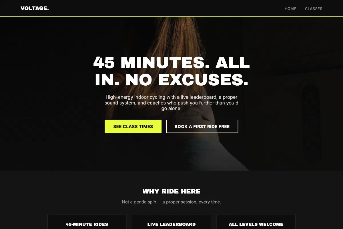 View the site
Voltage Cycling Studio
Bold & energetic
Neon yellow on near-black, built to feel like the lights just came up before a class.
 View the site
Momentum Climbing Gym
Bold & energetic
A third take on bold and energetic, burnt orange and charcoal, built for a gym that resets its walls weekly.
Premium and considered
For businesses charging a premium. Jewellers, private clinics, high-end trades, luxury venues. Deep colour, fine detail and unhurried pacing, because a site that looks cheap makes the price look wrong.
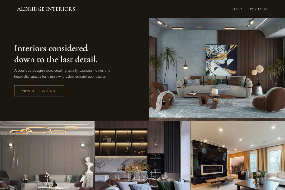 View the site
Aldridge Interiors
Premium & sophisticated
A quieter, editorial feel with darker tones, built for a brand selling a considered, high-end result.
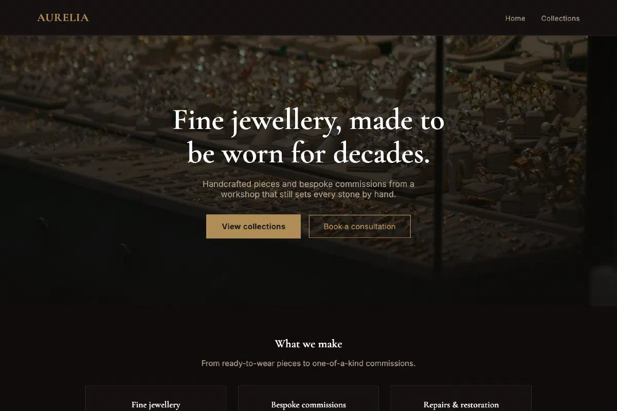 View the site
Aurelia Jewellery
Premium & sophisticated
Black and gold on a dark ground, for a brand that wants every page to feel like an unboxing.
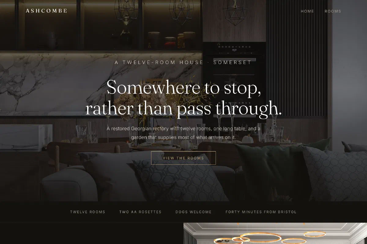 View the site
The Ashcombe
Premium & sophisticated
Near-black, wide letter-spacing and full-bleed photography, built so twelve rooms feel considered rather than merely expensive.
Natural and grounded
For businesses rooted in place and material. Garden design, wellbeing, food producers, sustainable trades. Earthy palettes and honest photography, with enough calm in the layout to match what's being sold.
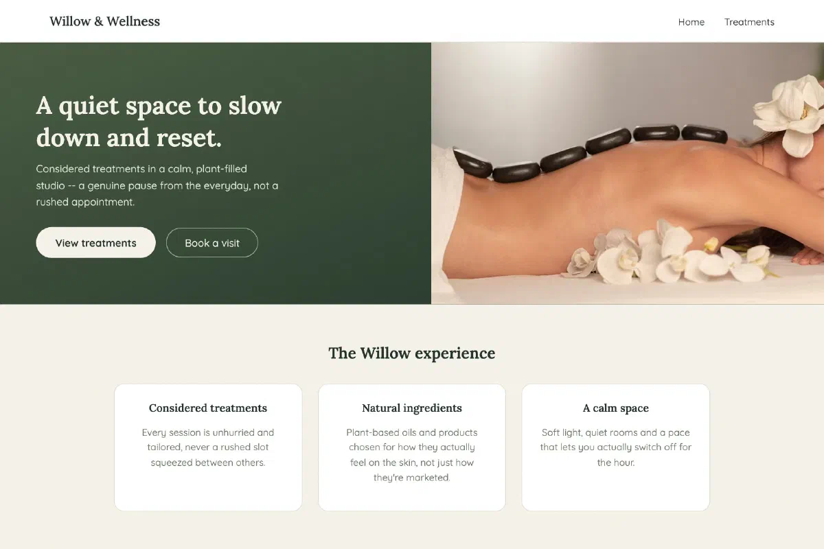 View the site
Willow & Wellness Spa
Natural & organic
Soft, earthy tones and calm pacing, designed to feel like an extension of the treatment room itself.
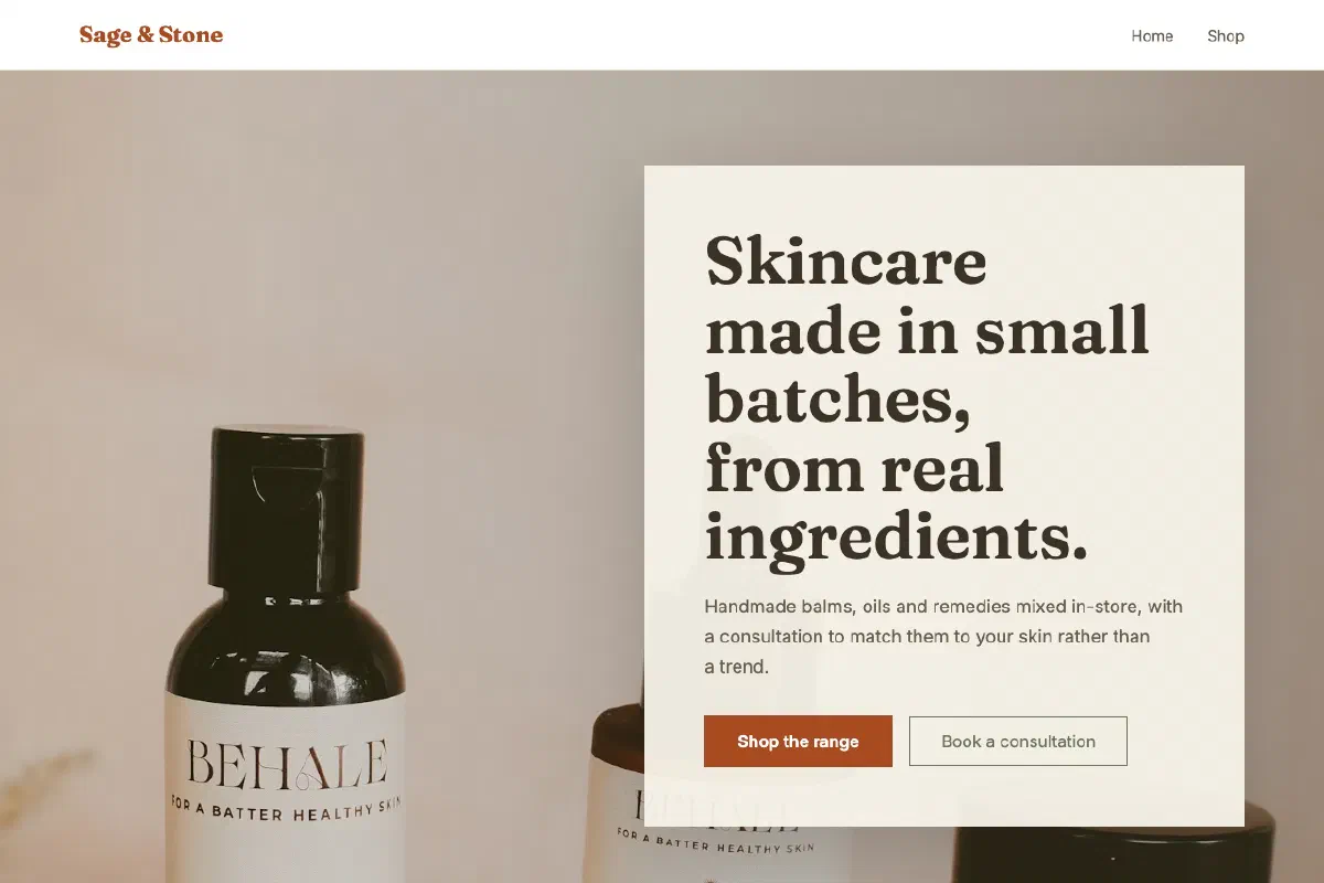 View the site
Sage & Stone Apothecary
Natural & organic
Sage and terracotta rather than spa green, for a shop that mixes its own products by hand.
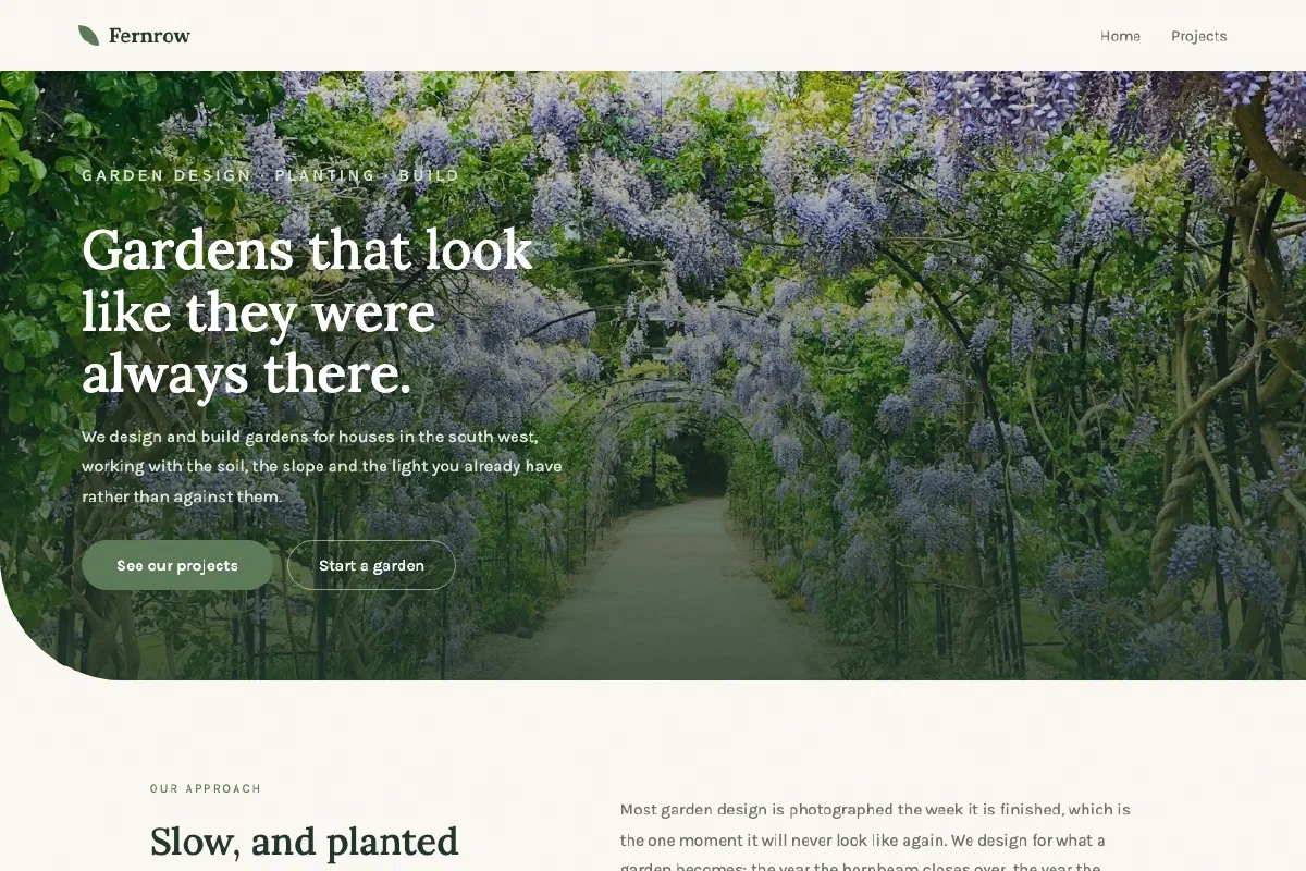 View the site
Fernrow Garden Design
Natural & organic
Deep greens, curved edges and a deliberately staggered gallery, for a practice that designs for year six rather than the launch photo.
Playful and characterful
For businesses with personality to spend. Creative services, independent retail, artists, children's services. Where being memorable matters more than being conventional, and the design is allowed to have a sense of humour.
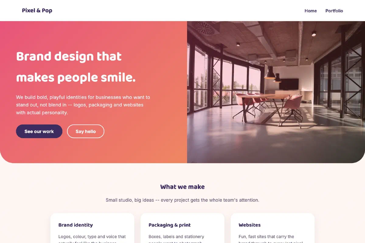 View the site
Pixel & Pop Design Co.
Playful & creative
Bright colour, bold type and playful shapes for a brand that wants to feel fun before it feels formal.
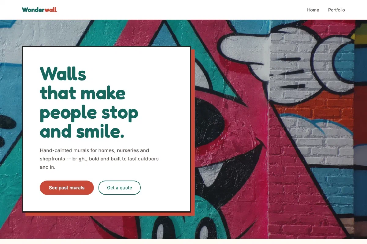 View the site
Wonderwall Murals
Playful & creative
Teal and coral in place of purple, for a mural artist whose work is the real showcase.
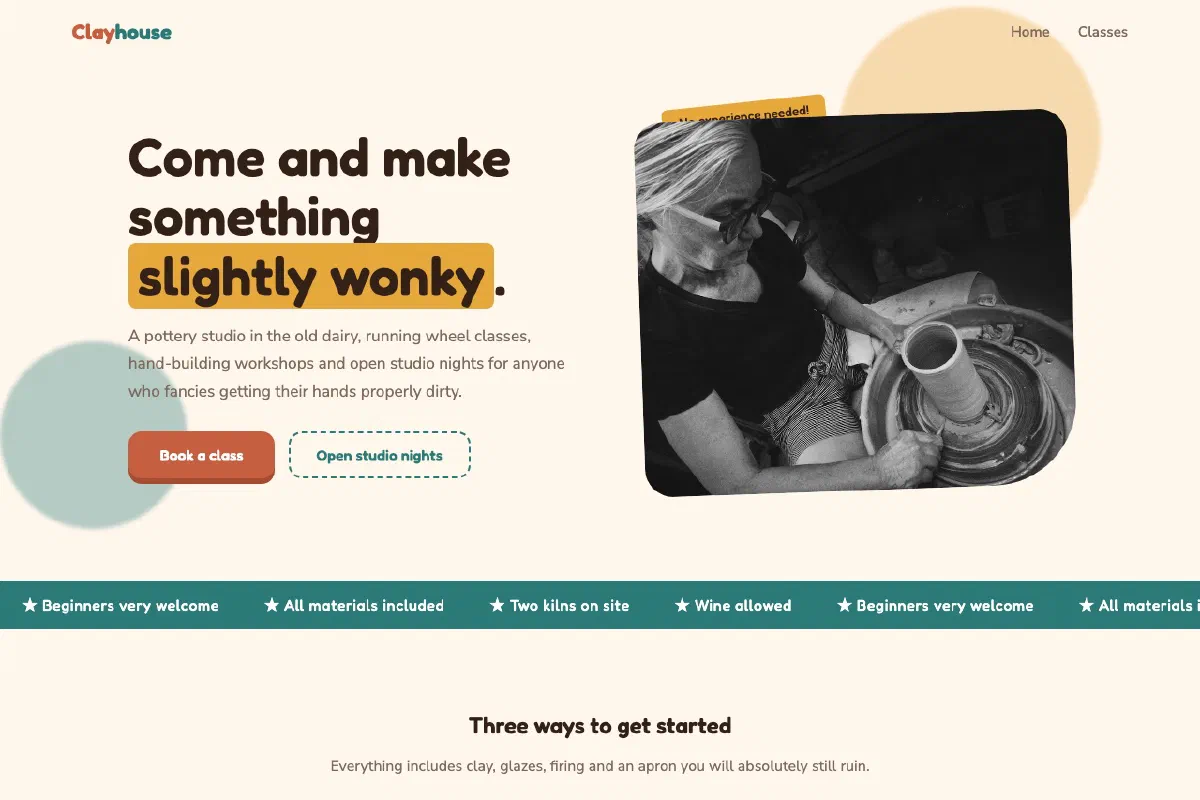 View the site
Clayhouse Pottery Studio
Playful & creative
Hard shadows, tilted photos and a marquee of its own selling points, cheerful without losing the timetable and the prices.
Heritage and craft
For businesses with history behind them. Traditional trades, pubs, family firms, restorers. Classic typography and warm materials, so decades of doing something properly actually read on the page.
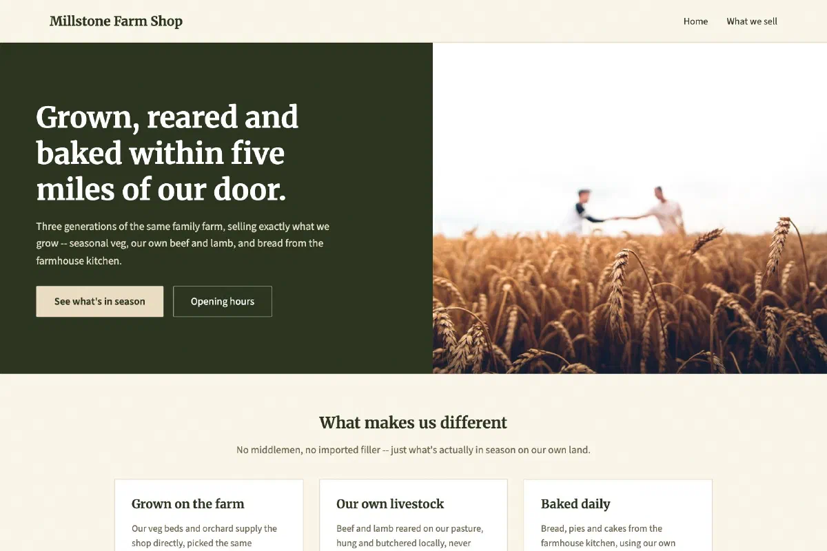 View the site
Millstone Farm Shop
Rustic & traditional
Warm earth tones and a traditional serif voice, built for a business that trades on being genuinely local.
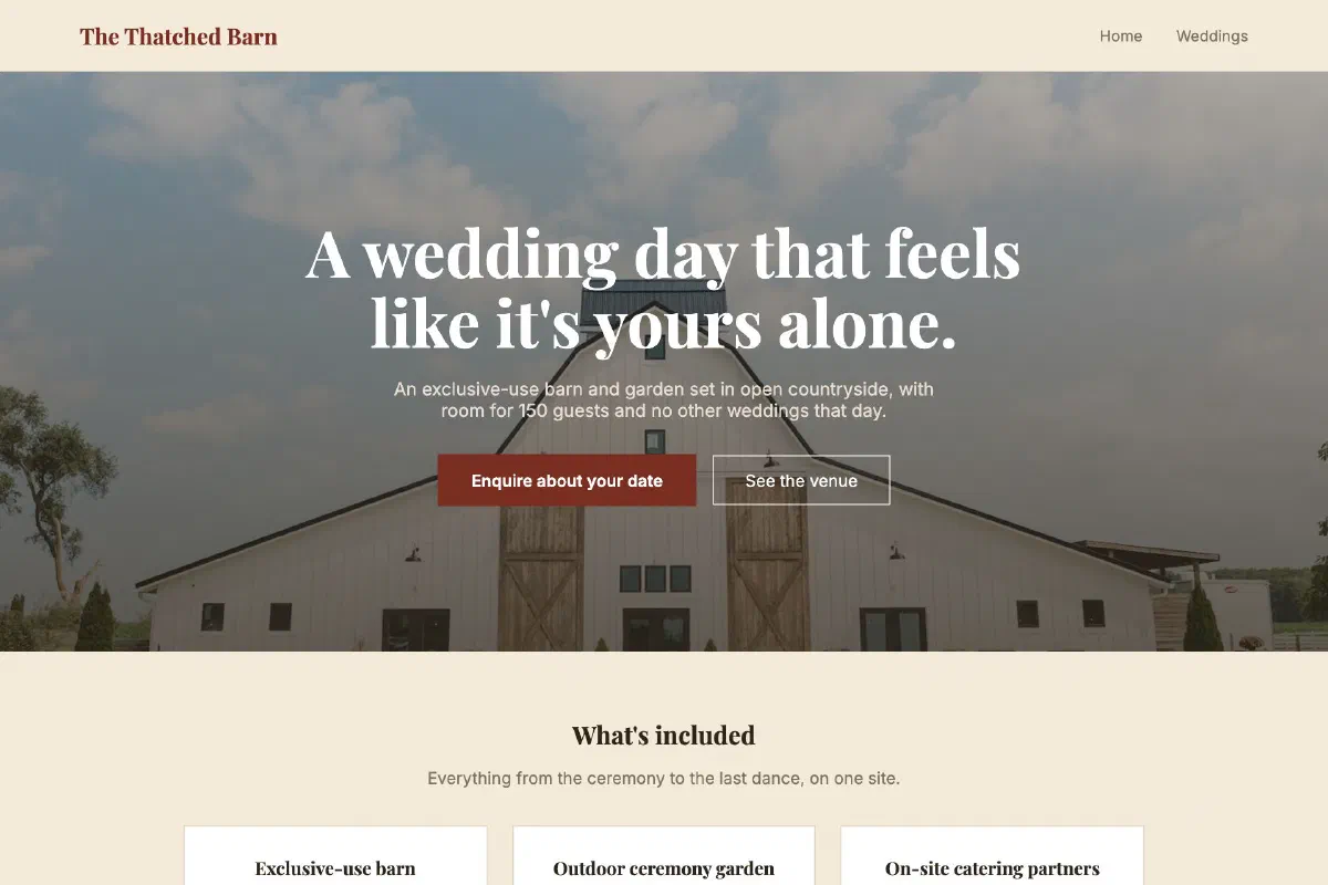 View the site
The Thatched Barn
Rustic & traditional
Deep red and cream instead of farmhouse green, for a wedding venue with a more formal rustic feel.
 View the site
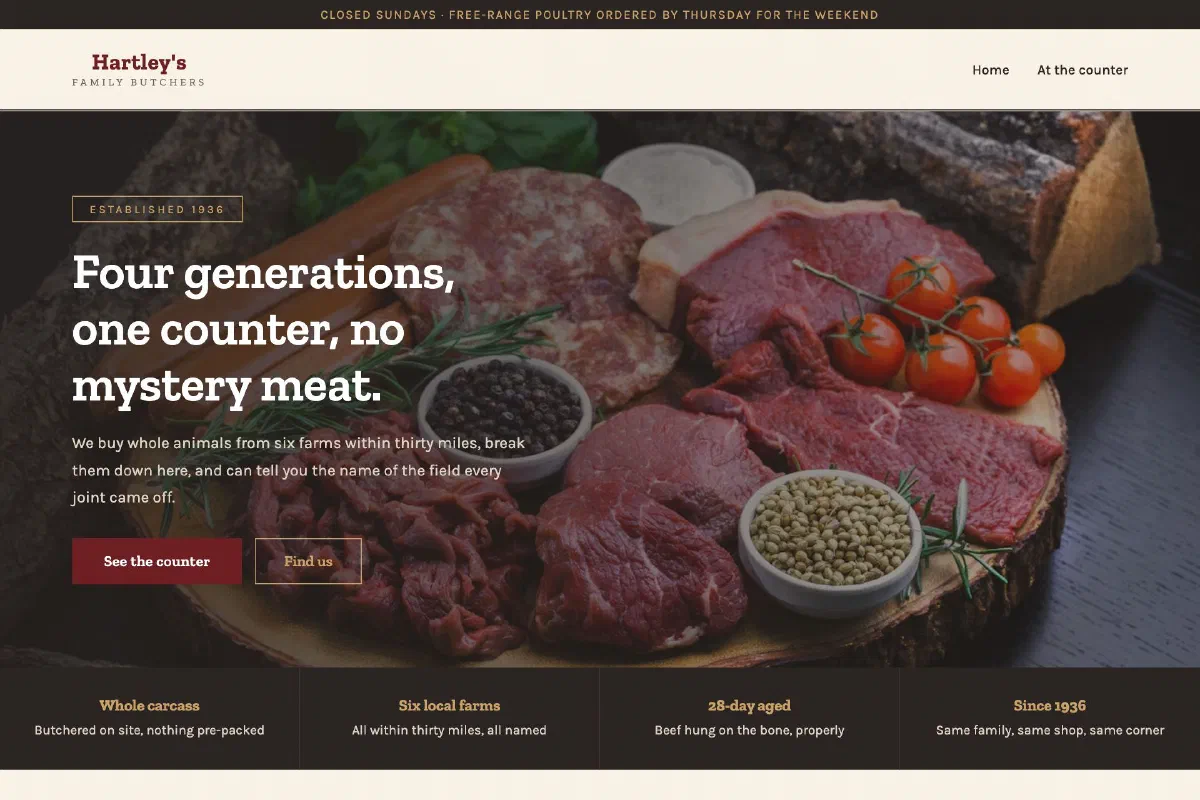
Hartley's Family Butchers
Rustic & traditional
A double-ruled header and a price board rewritten weekly, for a shop whose credibility rests on naming the farm.
Precision and clarity
For businesses selling expertise. IT services, engineering, technical consultancies. Clean structure and unfussy design, because the goal is to look competent rather than creative.
 View the site
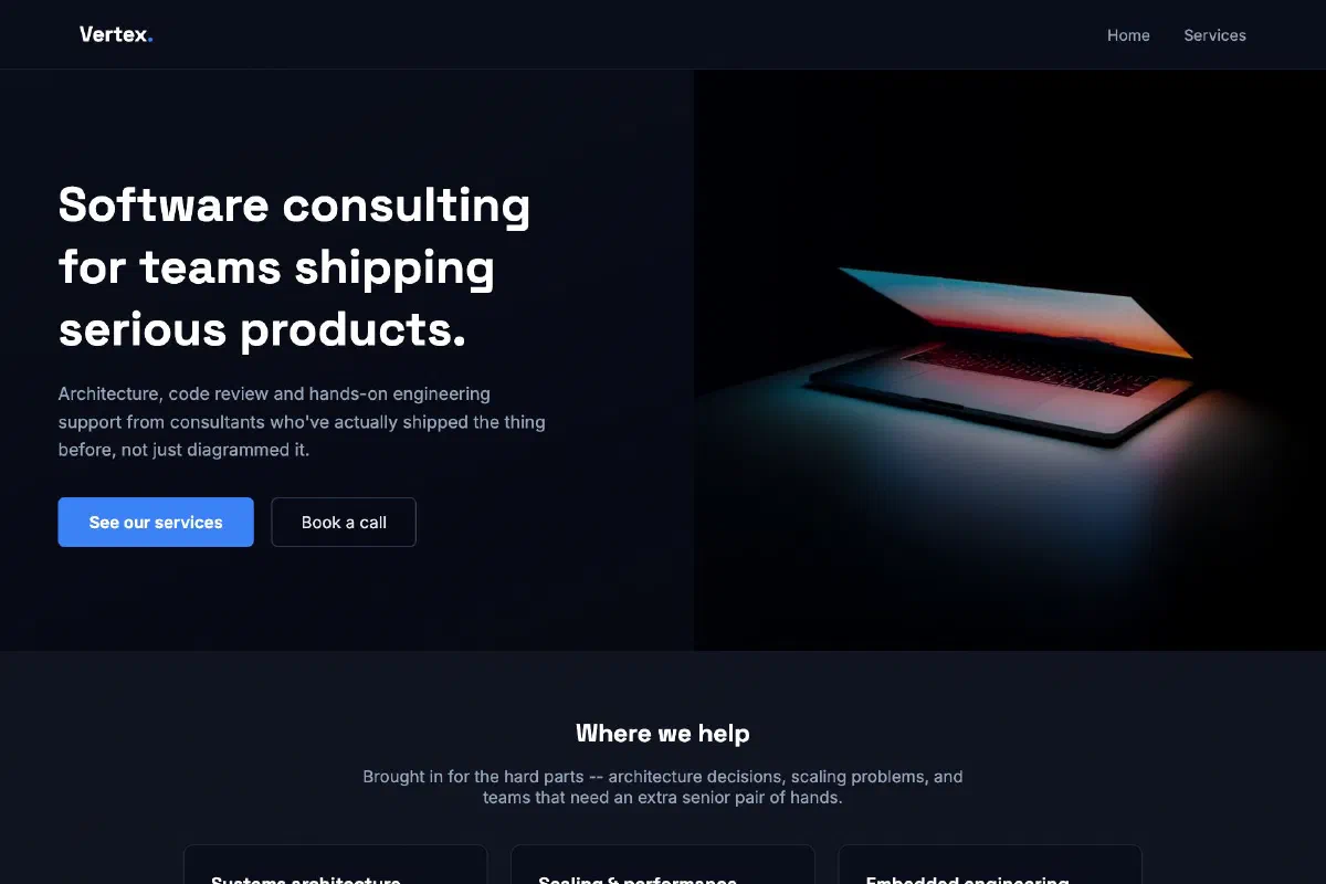
Vertex Software Consulting
Tech & innovative
Dark, precise and confident, a layout built to read as technically credible from the first scroll.
 View the site
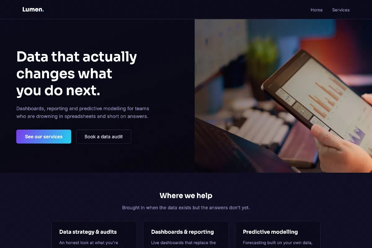
Lumen Analytics
Tech & innovative
Purple and cyan on dark navy, for a data consultancy that wanted to look as sharp as its dashboards.
 View the site
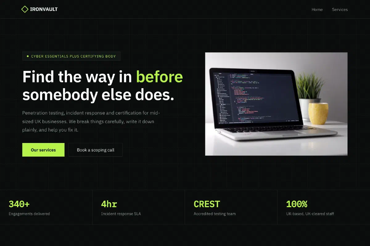
Ironvault Cyber Security
Tech & innovative
A grid-lined dark layout with monospace signposting, where the strongest sales line is an admission that you might not need them yet.
Honestly labelled
These twenty-nine sites are example concepts we designed and built to demonstrate range, for fictional businesses. They are not live client sites, and we would rather say so plainly than imply a client list we don’t have.
Everything else about them is real: they were designed and written the same way, to the same standards, by the same people who would build yours.
Yours would be the thirtieth, and nothing like the other twenty-nine.
Tell us about your business, review exactly what we’ll use, then your first monthly payment starts a design made specifically for it.
No setup fee · No contract · 10 revisions a month